


 (Photo: EPA-EFE / Yeshiel Panchia)
 Pollsters are fond of the joke that says elections are only held to see which pollster got it right. In truth, by election time, pollsters are forgotten, as are their predictions.
Wolfgang Donsbach, in a global review of polling and its possible impact on election outcomes, concluded that “the effects [of polls] remain first of all minimal and secondly they can be seen as completely harmless.”
He went on to note that polls are commonly drowned out by the electoral predictions of the media and politicians, and that the significance of polls “is overestimated by both politicians and social scientists”.
Perhaps not what pollsters want to hear, but a healthy corrective to the hype that surrounds the release of a new poll, and the bitchiness of post-release commentary.
As we approach national and provincial elections on 29 May, readers are already being bombarded with polls of many shapes and sizes, often generating disparate or conflicting results. This feeds a fairly common view (in Daily Maverick’s comments section, for example), which suggests that if you were to cross a corrupt lawyer with a crooked politician you’d get a pollster, who should be treated accordingly.
This may be compounded by some of the technical jargon that is used in articles and press releases but very rarely explained – weighting, imputing, missing data, margin of error, confidence internals and the like. This article tries to explain why those terms matter, using data published recently in Daily Maverick.
The deliberate use of technical language for a general readership may be part of the mythology creation that every profession does – baffling with bullshit, in short.
Sociologist Karl Mannheim noted many years ago that these myths may be “intentional or unintentional, conscious, semi-conscious, or unconscious, deluding oneself or of others, taking place on a psychological level and structurally resembling lies”.
Where pollsters fall on this scale is left to the reader.
An unregulated industry – time to change?
First, a couple of broader points. Polling in South Africa is entirely unregulated.
In the UK, poll quality is overseen by the British Polling Council, in America by the National Council on Public Polls (though not very active); there is a global academic/practitioner entity, the World Association for Public Opinion Research (Wapor), and many others.
These bodies set standards, can demand transparency from members (including publishing micro-samples of anonymised data for quality checking), and make findings on the work of their members.
Even if it were only voluntary and self-regulating, creating a South African equivalent may be an important intervention to maintain quality and to help consumers of polls.
Second, we are at least free to poll!
Many countries have banned polling, and many more embargo them.
Latin America has the largest share of countries with pre-election poll embargoes. Europe is second.
Wapor noted that “in nearly a third of… countries in West Asia and North Africa and sub-Saharan Africa, it is not permitted to publish polls about elections and voting (in about a quarter of countries in those two regions, polls about voting cannot even be conducted).”
In total, governments officially regulate polls in a third of all countries globally, and one in four countries (of the 157 studied) do not permit surveys that deal with religion, crime or voting. Their surveys must be rather dull affairs.
Wobbly polling
In the 2010s, the quality of polls declined (or wobbled rather badly) internationally, and the polling governance entities became more prominent.
The Pew Centre reported that “93% of national polls overstated the [2020] Democratic candidate’s support among voters, while nearly as many (88%) did so in 2016.”
The problem persisted, as Nate Silver noted: “2020 had the highest average error of… six presidential general election cycles… (albeit only a tenth of a point worse than 2016). And it was tied with 2016 for being the worst cycle for presidential primary polls.”
In the United Kingdom, polling for the 2015 election was described as “appalling” and the British Polling Council convened an official inquiry specifically to understand why this was the case, noting that the polls preceding the 2015 general election “were some of the most inaccurate since election polling first began in the UK in 1945”.
Even Donald Trump is a problem: American pollsters are “holding their breath”, according to The New York Times.
They know the problems: people are not taking pollster calls, turnout is unpredictable, and Trump supporters in particular refuse to take part in polls.
Some percentage of people also answer out of annoyance at being polled. This results in “4% of Americans reporting they have personally been decapitated”.
Transparency
The main conclusion of the UK inquiry, as of every other entity analysing poll quality, was the same: transparency was paramount.
Nate Silver noted that “our research finds that pollsters that meet the transparency criterion still are outperforming others”.
Put simply: pollsters who provide clear explanations on how the poll was conducted tend to be more accurate than those who do not.
Surveys – the basis of polling – are resolutely based on random samples, where everyone in the population has an equal chance of being selected. This generates surveys that include a range of all types of people from all types of communities in the country, thus covering race, religion, sex, politics, income and so on.
A well-drawn sample also allows relatively small sample sizes to reflect the views of the entire country, with measurable accuracy.
When teaching sampling, the easiest analogy is the bowl of soup. To test if soup is ready, you stir it well, and one spoonful will tell you the answer, rather than a spoonful from left and right, top and bottom, and so on. A sample is similar: if it is well mixed, a small number can (with measurable accuracy) represent the whole.
Bigger samples do have lower error bars than small samples, but they are horribly expensive. The recent Change Starts Now poll, with a 9,000 respondent sample, had an error bar below 1%.
Ipsos released a poll soon afterwards, with a sample of 3,600 and told readers that “all sample surveys are subject to a margin of error, determined by sample size, sampling methodology and response rate. The sample error for this sample at a 95% confidence level is a maximum of plus or minus 1.8%”.
The “sampling strategy” was not explained, but a 1.8% sample error means that if the same procedure is used many times over, 95% of the time the correct population average will be within the sample estimate plus or minus 1.8%. The “plus or minus” matters – a finding for the whole sample may be down by 1.8% or up by 1.8% - that’s the range of error.
The raw data are then “weighted” to the total population. Weights are adjustment factors. If, for example, your fieldworkers realised a sample with men at 43%, they would be weighted up to the 49% they should be; the too-large female sample would be adjusted in the opposite direction.
Clearly, sampling is a key problem for both phone-based and internet surveys, also used in South Africa.
In 2023, South Africa was said to have internet penetration standing at 72% – so are the remaining 28% simply bypassed? What happens if that 28% of people are markedly different from the 72%, either demographically or in the views they hold?
Census 2022 found that 92% of the population had a cellphone. Again, what of the 8% who do not?
In households where one person owns a cellphone, what about the characteristics of the others?
In rural India, 91% cellphone penetration existed at the time of Covid – but this varied widely depending on which voting district was being studied.
Furthermore, the study found, “poverty is just one dimension of exclusion.
“In the Indian context, mobile phone ownership can vary across gender, age and caste. Previous surveys have found that within households, women and elderly individuals are less likely to have access to mobile phones than younger men.”
The parallels with South Africa are obvious.
To complicate matters further, many people own multiple cellphones, mixing work and personal, and using different providers. Others buy pre-loaded SIM cards and use them until empty, and buy another, so numbers change frequently.
Many people loathe being cold-called, and refuse to answer, or put the phone down when irritated. In America, where phone surveying was formerly the gold standard, response rates have gone from 36% in 1997 to 6% today.
The role of the reader
Surveys and polls come with some rules that need to be made clear to readers, so the reader has to do some work too – if engagement is not entirely based on a priori disbelief, which seems an odd starting position.
The key question that readers ask when confronted by a poll is – “can we trust the findings?” To be able to answer that question, we now know that some basic knowledge of terminology helps, but the key criterion is transparency on the part of the pollster – about the poll and about what they are doing with the data.
Look at the slice of KwaZulu-Natal data from the Change Starts Now survey. Here you can see all the options available to respondents set out transparently – the only filter is the need for them to be registered voters.
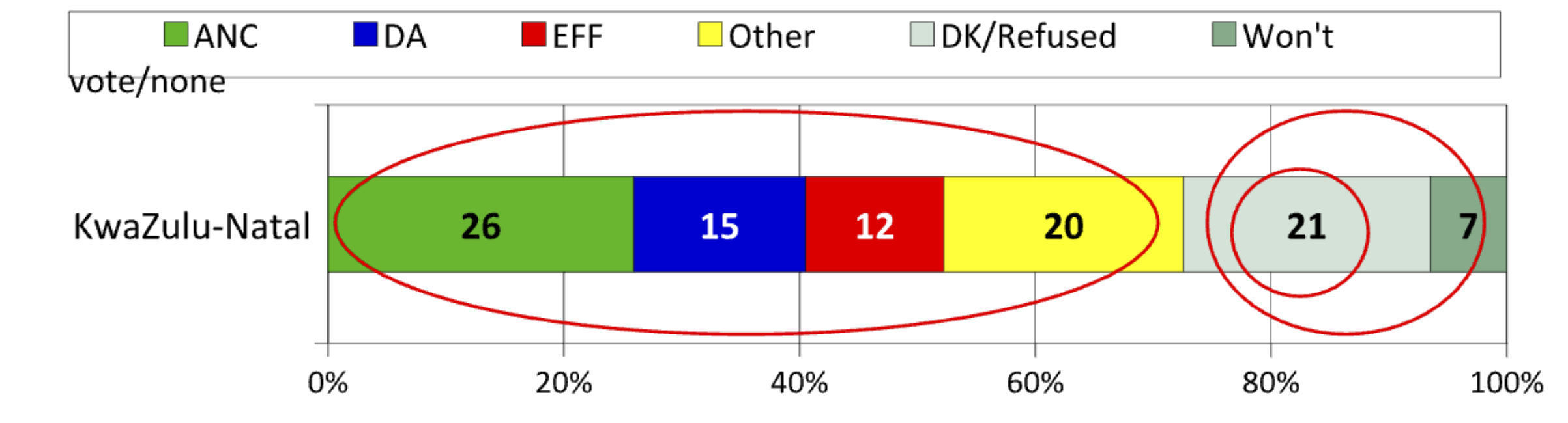
Clearly, this survey did not claim to predict the election – fieldwork occurred in November and a week of December 2023. No manifesto had been launched. No campaigning had begun. Established parties (especially the ANC) are traditionally polled at their lowest ebb this far out from voting day.
Thus while some readers insist that the data need to be recalculated to only show how votes will look as if it were election day, this is rather silly. If the reader wants to know the answer, being transparent with the data – showing all options (as our kids learn at school, show all your workings) ensures they can do so themselves.
Simply subtract the “won’t vote” and “DK/Refused” groups (the larger red circle on the right) to keep only declared voters in the frame (the red oval), and re-percentage (ie party votes are now calculated out of 72% of KZN respondents who stated a vote preference): the ANC comes out at 36%, the DA at 21%, the EFF at 17%, and “other” at 28% (percentages have been rounded up and may not add up to 100%).
But for smaller, new parties, suddenly it appears there are no available votes for them – everyone is already committed.
However, you can see (from the original graph) that 28% of the sample has been re-percentaged out of existence. The story this far from the election is the full spread of views, not a desperate rush for a headline.
When polls are released mere weeks away from 29 May, the graphs should show election predictions: six months out, that would be asinine.
But is that really the key finding here?
Surely the fact that 28% of KZN respondents refused to give a party choice is profound: it speaks to the fear that remains prevalent in the province, and also the fact that organising for the newly launched uMkhonto Wesizwe (MK) party has been happening for a while – MK was not an option in the survey, so how many were refusing to choose a party because it wasn’t there? Surely it is better to see that large undeclared group than re-percentaging them away like pixie dust?
Given that MK is taking votes from other parties and has a 28% pool of undeclared votes to fish in, and could be a major disrupter – that is the key takeaway from this graphic.
That 28% can also be “imputed”. Simply put, data are used to model the “typical” party voter (generally by demographics, preferably with social attitudes included), and any respondent who refused to choose a party but matches that profile is imputed to the party whose voters they seem to typify.
In this case, one may say that rural, African men with matric education and aged above 29 are typical Inkatha Freedom Party members: thus everyone who fits that profile but did not choose a party is imputed to the IFP tally.
This may help parties with backroom strategising. But it is entirely wrong to impute votes and not tell the reader exactly how you did so, and show the before and after data. (And most won’t want to show their imputation technology, since it is a strategic tool.)
Again, angry letters demand that recalculation and/or imputation must be done – but with no value-add this far out from the election, it sounds rather inane.
So: check your pollster. Are they telling you how they ran the survey, what methodology they used, their error bar and showing you all their data? Or are they just showing you a recalculated (including imputation) final tally of their own, and asking that you “trust us”?
I know which one I prefer. DM
David Everatt is a Professor at the Wits School of Governance.