


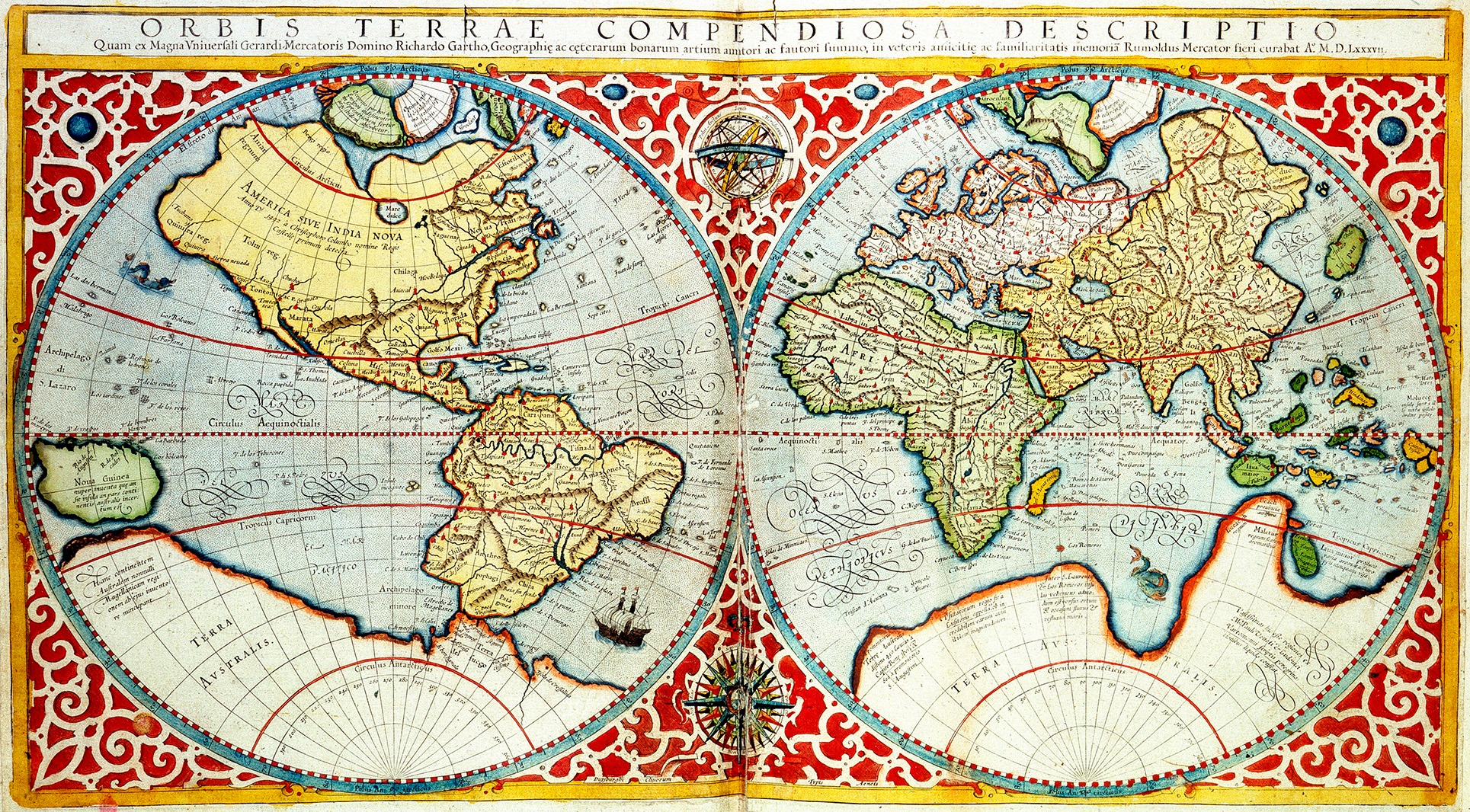
 World Map, 1587. 'Orbis terrae compendiosa descriptio'. Divided into Western and Eastern Hemispheres, the map speculates on the position and coastline of a vast, then undiscovered southern continent. Creator: Gerardus Mercator. (Photo by Heritage Art/Heritage Images via Getty Images)
 There is an episode in The West Wing television series in which White House press spokesperson CJ Craig meets a delegation of cartographers, who explain that the standard world map — a Mercator projection — must be replaced. Instead, the US should adopt the Peters equal-area projection, despite the Mercator projection having been used for nearly 500 years.
While this TV episode is fun to watch, it makes a serious mountain out of a seeming molehill. The Mercator projection was created in 1569 by Flemish mapmaker Gerardus Mercator. It responded to the need by European mariners in the early years of the “Age of Exploration” for maps giving sailors a reliable way to plot their courses. Mercator projections became increasingly valuable as tools for explorers, merchants – and conquerors.
The value of Mercator’s projection was that it allowed straight lines to be drawn from point A to point B as accurately as the actual directions of sailing and compass headings. With the increasing number of voyages taking place around the globe, Mercator’s maps, along with instruments such as sextants, allowed sailors to confirm their locations north and south as well. These tools helped turn navigation into a science rather than a secretive navigators’ art.
For many centuries, there had been maps made in Europe, Ptolemaic Alexandria or the Islamic world (and further east), but none were effective for navigation. Instead, they were drawn to provide symbolic content, such as the location of Atlantis beyond the Strait of Gibraltar, or, for Christianity, the three continents – Europe, Africa and Asia – as wedges of a circle surrounding Jerusalem as the centrality of it all.
Sailors hugging the European coastline or in the Mediterranean Basin largely relied upon guidebooks like a periplus in antiquity, and later, a rutter or a portolano. They described landforms, harbours, barely exposed rocks, tides, and currents, and so sailors could travel from one port to the next. The contemporary equivalent might be the way London taxi drivers memorise “The Knowledge” of thousands of streets to deal with that massive conurbation.
A more astonishing example was the combination of knowledge and those stick and shell constructions Polynesian mariners relied on to sail the Pacific. Those models precisely described the currents and winds, and where the islands of the Pacific were.
Navigating distortion
The challenge Mercator set for himself was different from those old mariners’ guides, or even those beautifully illustrated maps – with their drawings of fanciful creatures and imaginary landscapes in the cartouche — but navigationally useless ones.
Mercator recognised that while the Earth is a sphere like an orange with the oceans and continents spread across the surface, a map is a two-dimensional item. Turning the three-dimensional skin of the fruit into two dimensions requires introducing distortion into the final product.
/file/attachments/orphans/GettyImages-1175734125_281277.jpg "Gerardus Mercator (1512-1594), the Belgian geographer, cosmographer and cartographer known for his 1569 world map of sailing courses with rhumb lines, an innovation still employed in nautical charts. From Biographical Illustrations by Alfred Howard. [Thomas Tegg, R Griffin and Co, J Cumming, London, Glasgow and Dublin, 1830]. Artist unknown. (Photo: The Print Collector via Getty Images)")
Readers who wish to get a hands-on sense of this challenge can try a simple experiment. Draw the continents on the skin of an orange and cut a series of equal-sized gores into the skin of the fruit from top to bottom, with all of the tops and bottoms converging at the south and north “poles”, but leaving the centreline (effectively the equator) connected, one gore to the next.
When you peel off the skin and lay it flat, there are rather large blank spaces evenly arrayed across the new two-dimensional item. If you have drawn the outlines of the continents on the skin, you will introduce distortions if you try to deal with all that blank space.
To provide for pilots to set out true lines of navigation, or rhumbs, Mercator’s solution was to take the boundaries of continents and stretch them until they reach those otherwise blank spaces between the gores. In essence, he sacrificed accuracy in the size of the continents (although their relative shapes and contours would remain accurate).
/file/attachments/orphans/Mercator_1569_199523.jpg "Mercator world map. (Image: Wikicommons)")
The further from the equator, the more those northern lands – Greenland, Siberia, what became Canada, northern Europe, Alaska – became huge in comparison to South America or Africa, which had not been distorted. If you are a sailor, continental distortions may not be much of a problem. If you are a politician attempting to articulate the size and importance of your nation in comparison to others, this remaking of reality generates some seriously false understandings of geopolitics.
In the map almost everyone was using in the 19th century, one easily saw an enormous imperial Russian expansion into central Asia and Siberia, poised to pounce on Britain’s Indian Raj, giving the impression of a huge looming Russia about to crush British ambitions. A map helped fuel imperial competition over control of their respective borderlands and into Afghanistan. A treaty finally created that pigtail of territory in the northeast of Afghanistan, dividing Russia from British India and touching the western border of Manchu China.
The inevitable distortions of a Mercator projection have been the subject of numerous attempts to design a global map that distorts relative sizes of countries and continents much less and keeps a continuous map surface as well. But such efforts introduce spatial distortions, such as a very squished-looking Greenland at the northernmost margin of the map. Even the Peters projection in The West Wing episode and other equal area projections produce distortions – just different ones.
Thus, there have been other efforts to preserve territorial integrity, accurate shapes, and relative sizes and distances. One example was designer Buckminster Fuller’s Dymaxion projection. With his, the landmass proportions are correct and the relative sizes are accurate.
/file/attachments/orphans/GettyImages-120984186_930720.jpg "American designer, architect and engineer Buckminster Fuller (1895-1983), circa 1982. (Photo: Nancy R Schiff / Getty Images)")
But it comes at the cost of breaking up the continuity of the map’s surface. Fuller’s map used a series of smaller triangular-shaped maps, each with low levels of distortions, and connected each triangle to another until all the continents were included. Such a map would be less than useful for navigation, of course, but the sizes and shapes of landmasses were accurate.
Now, of course, no one needs a Mercator projection of the globe for navigation purposes. Every ship, except perhaps an inflatable life raft after sailors abandon ship, makes use of geolocation satellites, as well as providing signals from their transponders, giving other vessels and land-based headquarters accurate data about where, precisely, they are.
Recently, we can see images of the Strait of Hormuz in real time with dozens of dots indicating ships waiting to transit the Strait, all identified by transponder signals. Commercial vessels keep these transponders operating in accordance with standard maritime navigation rules, and turning them off is a presumption of illicit activity. Thus, the AU’s real argument against the bog-standard Mercator projection in offices and classrooms around the world lies elsewhere.
/file/attachments/orphans/Brooks-AUrecommendstrashingMercatormaps_Dymaxion_projection_859742.png "Dymaxion map. (Image: Wikicommons)")
Fair representation
In 2025, the African Union took the position that the Mercator projection unfairly minimises the size of African nations, since they are closer to the Equator than to the North Pole and are not enlarged the way Mercator’s map makes Greenland look larger than Africa.
In response to this, the AU voted to support the Equal Earth projection to show Africa’s true size and geographical significance. Their vote was in sync with campaigns by groups like Correct the Map, Africa No Filter, and Speak Up Africa. As Togolese foreign minister Robert Dussey said, “We need a new political map of Africa that shows its true size and place in the world. A fair representation of Africa is essential for global awareness, education and geopolitical understanding.”
The AU argument, simply put, is that the Equal Earth projection actually depicts the sizes of nations and continents more accurately, giving a much better portrayal of Africa’s actual size, albeit at the risk of distortions in the actual shapes of the continents. It is, however, not useful for navigation, as the Mercator projection is.
/file/attachments/orphans/Brooks-AUrecommendstrashingMercatormaps_Equal_Earth_projection_SW_942764.jpg "Equal Earth projection. (Image created with Geocart map projection software / Wikicommons)")
Moby Makura of the Africa No Filter movement added, “Accurate representation is not just about maps, it is about agency, progress and ensuring the world sees Africa as it truly is.”
The AU challenged member states to use the projection in their national curricula as “cartographic justice”, tying this idea to broader issues of African identity and the African Renaissance movement as part of an effort to achieve something called “cognitive justice”.
/file/dailymaverick/wp-content/uploads/2022/03/h_54070132.jpg "The African Union headquarters building in Addis Ababa, Ethiopia. (Photo: EPA-EFE / STR)")
Interestingly, the United Nations was way ahead in this idea, back when it was founded, with its insignia/emblem in its flag and on all its documents. In 1946, a UN committee commissioned American architect Donal McLaughlin to design a fresh new design for the body’s emblem. He drew a polar azimuthal equidistant projection where the continents’ sizes are relatively accurately portrayed, but with all of the landmasses of the planet surrounded by one global ocean.
The purpose of McLaughlin’s design was symbolic rather than utilitarian. His circular map is flanked by two stylised olive branches, and the entire design was meant to represent peace, hope and global unity.
In this sense, the AU’s (and The West Wing’s writers) call for a new map for the globe makes sense since a map is much more than just basic geographical data. There are always meanings and symbolic content in them, such as the fanciful animals, dragons of the past, and even colour choices.
At the end of the 19th century, world maps almost universally portrayed the British Empire in a bright shade of red – paralleling those coats worn by its soldiers – with a Mercator projection that emphasised the vastness of that empire. Post World War 2, the Soviet empire in Europe most often had as a shade of red its basic background or border colour.
For the AU, in this matter of the right map, the deeper meaning is clear: Africa must not be a cartographical afterthought, and a new way of looking at the globe must be adopted to tell bigger truths. DM