


Industry experts gave City Press a qualified nod of approval, calling the paper’s new look classy and contemporary.
Journalism veteran and former editor of Mail & Guardian, Anton Harber, cautioned that the industry shouldn’t be too hasty to react. “One must always be cautious in responding to a new design, as one needs to give it time to settle down,” said Harber, adding: “I am finding the content of City Press to be sharper, newsier and to have more direction – and for me it is returning to the must-read status it had a while back. The design brightens and cleans up a paper which needed it, but I found the front few pages disconcerting – with so much white space and so few stories – and the colour somewhat gaudy. There were graphic elements I found hard to read and understand. I am sure that they will be fixed up in time.”
Media analyst and MD of Media Tenor, Wadim Schreiner, was more optimistic about the design, but cautioned City Press regarding its positioning. “I was very impressed with the new layout which is fresh and vibrant. The use of space is inviting and the article length has decreased, which is a good idea.” Schreiner said that to broaden the paper’s market, City Press would have to target new readers carefully with a distinct offering. “The layout certainly does the job of catching one’s eye, but if the content is not up to scratch, the paper won’t convert readers. There’s still some room for improvement with content as City Press lacks its own unique character. The paper has yet to develop a distinctive voice even though it has built a platform on which it can easily do this.”
There’s a lot at stake as City Press squares up against the Sunday Times. In terms of readership and circulation, City Press is a bit more than half the size of the Times, so it’s a lot like watching the middleweight take on the heavyweight. What can’t be discounted is the stature of the media groups that back these two prize fighters. Naspers easily overshadows Avusa, and has much deeper pockets. More importantly, Koos Bekker wants City Press to broaden market share and this is said to be one of his pet projects. This means there won’t be a shortage of resources or talent available to help realise market growth.
Advice from media planners is that City Press will need to work hard on its position to broaden readership and win increasing advertising favour. “As advertisers, we are generally conservative. Think of us as conservative investment managers; we will wait for circulation figures to see if the paper has grown,” says The Media Shop’s Donald Liphoko. “The new look is more accessible which means that media planners will buy it and read it, and that’s a very important constituent for City Press convert.”
A regular City Press reader, group managing director of Yellowwood Ivan Moroke said the paper had done an important job of not alienating loyal readers. “The new look is contemporary and classy, but the paper has remained very loyal to its roots which is important to existing readers.” Moroke said, while design will help build a strong media brand, it is content that sways consumer buying behaviour. “People don’t buy newspapers purely for design. The power lies with the headlines, but good design enhances the media product, particularly when you’re trying to speak to new readers outside of your regular base. City Press has balanced the old and new beautifully. It has made the existing offering better for loyal readers, while offering new readers a world-class publication.”
Trend analyst and media junkie, Dion Chang said the layout was just what consumers of media need right now. “The new design presents sections in a very structured way which will be much appreciated by consumers. We ingest and consume a flood of information that comes to us in a very random fashion, so the new layout is helpful for an exhausted mind. The new ‘Seven’ or pulse section will also do incredibly well because it offers real competition to Sunday Times’ Lifestyle for the first time.”
City Press editor Ferial Haffajee said the first round reactions had been heartening. “Our readers have said they love the new look, and find the paper fresh and easy to read.” Haffajee said the next step would be the paper’s website, but said this could take another 10 months to upgrade.
By Mandy de Waal
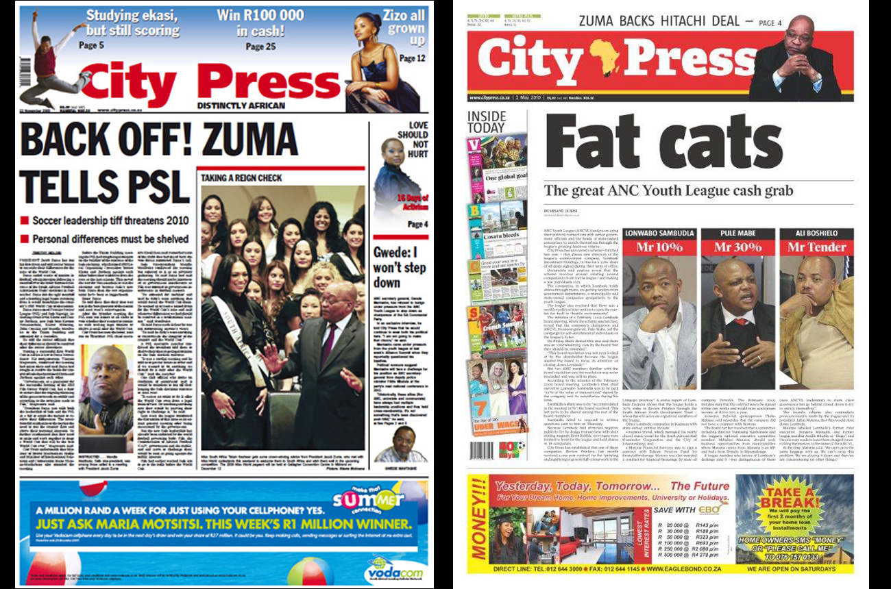
The new design was done by Peter Ong, who managed the makeover of Rapport late last year. In an earlier story The Daily Maverick reported that Ong overhauled the New Straits Times and the Sydney Morning Herald. Ong advises that the information given to us was incorrect. We regret the error.
City Press front covers via Charles Apple and Peter Ong. Read more of Anton Harber’s thoughts at The Harbinger